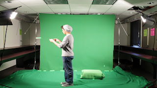
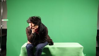
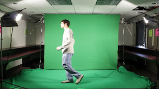
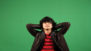
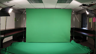
After a lot of wrangling of people and waiting for things to happen I was finally able to get a green screen shoot done in early February. It had been a long time coming because I could never seem to get all the required people that I thought needed to be involved together. Once it started getting down to it and speaking with Mar we finally came to the decision to put together a portable green screen in the old animation building and it actually ended up turning out well. I called up some animation friends who I had spoken too way earlier in the semester and set an immediate date.
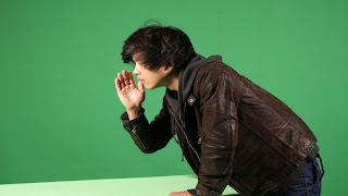
The set up was pretty easy and the software I was using was IStopMotion which worked very similar to Framethief so it was an easy learning curve. With some help from some other senior animators the shooting got underway and in two days time I was able to get enough footage to where I never had to do any reshoots. The motion was all capured frame by frame with a camera and I took those and organized them into folders of their scenes. I then brought each individual scene into After Effects and used Keylight to remove as much of the green screen background as possible. I still had some leftover garbage though from green spill and for a couple scenes I had to bring the sequences into Photoshop and erase frame by frame the leftovers that were connected to the character. This was extremely tedious and not really knowing much about keying, maybe there could have been a different way to go but that is the rout I went. I then re-exported out of Photoshop and brought them back into After Effects and animated them from there.
Below are some of the invidiual photos of the shots as well as an initial compostion on the drawn backgrounds:
Wednesday, May 13, 2009
Characters
So before I had actually done the backgrounds I had to finish my animation on the characters. That actually proved less difficult than I had originally thought and I was very happy with how they turned out. I basically created 4 amorphous characters that would come in after the live action characters had been pulled inside the letter.
The designs came from my earlier class of Ideation and Preproduction which I took as a Junior. I had drawn a bunch of different designs which I posted earlier in my blog and I took those designs to create my characters. I wanted them all to be very different from one another and kind of be somewhat relatable to the real life characters they were portraying. I got some great feedback on the movements I came up with and didn't really mess with their movements after that. Once I had some cycles of them playing their instruments, it was fairly straightforward to put them into their respective scenes.
The way I chose to color them really came up kind of randomly because one night as I was working on some other animation I came up with coloring them in with a colored outline and filling them in with black. That way I could take the Flash sequence and bring it into After Effects and apply some glow and scatter effects to make them stand out. I later applied that to how the characters would be pulled into the letter and it ended up having nice continuity.
Here it is:
First Update in a while
So I haven't updated this in a while and I wanted to put in some of the work I have been doing over the past semester on my film. The film is completely finished but I still want to put up some of the information and tests I completed in the process to show how I was able to settle on a finished product. When I last left off I was working on some color tests and trying to decide what backgrounds I would use.
I was having a lot of problems trying to decide which direction to go with my backgrounds. I basically was torn between leaving them blank which seemed less and less like an option because a few of the backgrounds had a lot of detail that would have made it difficult to pickup the letters movement in space. However, I had other things to worry about that had a higher level of importance.
Push came to shove eventually and this last week I finally had to move in a direction. In the back of my mind I had an idea of what I could possibly do and that was to color them in flash which in some cases was difficult and then bring them into Photoshop and take out color and add some filters to get a look I was happy with. So that ended up being my pipeline for the backgrounds. I colored them, exported them to Photoshop, and then from there brought them into After Effects as a compositon.
Here is how some turned out:
Wednesday, December 17, 2008
Color Style Cont'd
So this is a kind of final iteration of what I am thinking for the coloring of the BG's in the real world. It is basically all gray and black, which turned out better than I thought it would. If this look gets a positive response I am going to move forward with it and color the rest of the BG's in a similar fashion. It is fairly simple to do and won't take long. Anyways here is the scene for your enjoyment.
Tuesday, December 2, 2008
Color Tests
For this week the bulk of my time was spent working on color for the backgrounds. I finished up a couple new backgrounds from my schedule but I then spent the rest of the time trying to find colors that worked. I am still unsure whether or not I like these ones I am posting but they are the best of the lot so far and I have done too many to post them all. My main goal in class today will be to work through these and find out what works but any feedback online will also be helpful. The color scheme was pretty muted and on a couple the quality when exporting was not so great but they still give an idea of color look. I colored these in flash and played around with some masks on a couple. Let me know what you think.
Monday, December 1, 2008
Character Animation
So for these next couple videos I got bored of doing the Backgrounds and decided to work a little with the characters and how they would appear inside the letter. Each movie represents a different characters entrance onscreen as animations inside the letter. Each scene is a different character transforming into an animation after being sucked into the letter and transformed from pixelation. I am still working with the characters so that they correspond a bit more to their live counterparts but I will change that once I have the pixelation shot.
As for the characters themselves, I went with a more amorphous blob look that transforms into a fanciful representation. I wanted the characters to have a flow to them and their movements, really smooth and to seemingly appear from nothing. I like some of the transitions but I need to work on their movements once they form up and have them play more of their instruments. I think they turned out pretty well though and I am looking forward to continuing work on their movements.
Letter Flying Away From House
This is something I put together a couple weeks ago and is probably my favorite scene so far. I am really happy with how the flying animation turned out and I am still trying to incorporate this speed and action to other scenes where the letter is flying. After telling the letter where to go, this shot takes place as it flies away from the boys home and begins its journey. I still need to place the jpeg images of the letter in for the blocked out grey letter box acting as a placeholder. Any comments would be appreciated.
Continued BG Work
As I have still not yet shot my pixelation yet I have been continuing to work on Backgrounds. I have been really happy with the shots and how they are turning out. I have settled on a line quality and style for the BG's but am still working out color.
I have all but decided against the use of moving holds on the BG's because some are complex and it was brought to my attention that it would distract the viewer. Especially in the case where the letter was moving across the screen as it diminished that movement and its importance in the narrative.
Instead I have been working with limited colors: greys, blacks, and playing with opacity. I feel like the initial part of the narrative the world should be slightly dull and rely more on the line quality and simplicity to contrast with more color later. Fuller color will be used in the world within the letter and I think that will contrast nicely. I am also planning to have the pixelation to be in black and white and I will color treat the parts where the characters are holding the letter to have slight color in the pixelation as they hold it. I will put up some of the coloring tests tomorrow after class hopefully. For now have a look at some of these new BG's and see what is working or how they could be more dynamic.
More Letter Test Animation
For these couple shots I have been playing with the letter and how it moves. I am still playing with the wing speed and how the letter moves but I think that it is quietly developing. The first video is when the the boy first puts the letter into the envelope and the wings react by flapping as it comes to life. The red is meant to represent the characters hands as he places the paper into the envelope. That of course will be pixelation once I do my shoot. I still need to add a few in betweens to smooth the motion out a bit but the look is something I think works. Also I need to fix how the paper is put into the letter but I will do that later.
This second video shows a different angle of the letter hovering outside the window, awaiting instructions on where to go next. I will probably change the up and down motion as it flaps its wings to be a little more pronounced but other than that I am fairly happy with how it turned out. I took the png images of the letter out of Photoshop and placed them into the flash scene. Let me know what you think or any questions about the motion.
Monday, October 13, 2008
BG's
Here are some of the backgrounds I have been working on. I have decided to just work on the coloring of one BG to get my style set and leave the rest uncolored so I can get all the angles and shots to have correct composition. I am still playing with the idea of having a moving hold on the lines themselves but I still haven't achieved a result I am happy with. Once I get something that I like I will put it up. For these backgrounds I worked a lot with real photos I took. Some stuff was rotoscoped while other items were just drawn in. I really like the look so far but let me know if anything else could be added. The first is the establishing shot of the house where the main character lives. The second and fourth are shots inside the characters bedroom. The third shot is a BG where the letter will fly through on its journey to another band member.
Subscribe to:
Posts (Atom)